Tata Nexon to now sport an ‘all-digital’ infotainment system
A move that'll mostly go well apart from when buyers are like me!

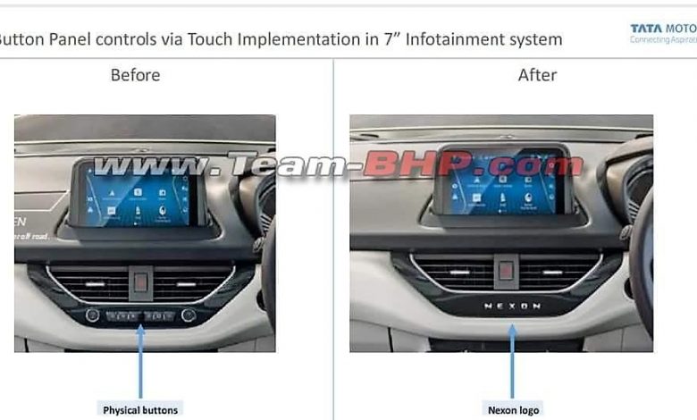
For Tata to follow the global trend, the Indian carmaker has now decided against the use of physical buttons for its Nexon compact SUV’s 7-inch infotainment system which can be had in the XZ and above variants.
The buttons that are removed are “Home”, “Favourites”, “Back”, “Smartphone” and “Next / Previous”. Additionally, the rotary dials for volume and tuner controls have also been removed in a bid to make it a completely digital experience. Instead, there is now a “Nexon” logo. Tata has also advised all of its dealers to do the same.
Race to which kind – physical buttons or an all-digital infotainment system?
Sure, an all-digital system is loved by many, mainly because it’s trending and that it gives the dashboard a clean and rich look. However, while driving, I don’t think that you would want to spend more-than-usual screen time by playing around the touchscreen which, in other words, is a dangerous and distracting thing to do.

Physical buttons were and still are, placed around the dashboard of a particular car for a specific reason, the biggest of which is safety. While on the move, at times, it gets unsafe when you’re trying to perform a function on the system using the physical buttons, however, imagine the kind of risk, an all-digital system would sport.
I, for one, would always buy a vehicle that has the correct amount of physical buttons in it – like the Audi Q2. But, there is a vast majority who don’t think twice before becoming a part of a trend and as such, would not mind the change in the Nexon. Again, that’s my opinion.
Although should Tata feel that there are more negative inputs and feedbacks from its potential Nexon customers than anticipated, it can re-introduce the physical buttons, just the way Audi did with its e-tron GT. What particularly grabbed my negative attention is that they did away with even the rotary dial for volume! That dial takes the least space, keeps the look neat and offers a very important functionality. A car without a volume knob is simply incomplete. Imagine the frustration of not being able to lower down the volume because the infotainment is stuck. After all, it is just a technological interface.
All I can now say is that we can only wait to see how the buyers respond to this change by Tata Motors. And how can I forget this – with Maruti Suzuki readying an all-new Vitara Brezza, who knows, the segment-leader too, boasts an all-digital infotainment system. Not how I wanted this.


