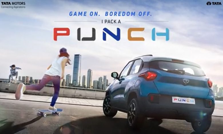
Tata has revealed that the Punch will have a dual-tone interior, via a teaser video and it looks very similar to the Altroz rather than the Nexon. It’s a good thing because if you look closely, the MID is exactly like the Altroz, something that even the Nexon does not have yet! I think the car will be teased extensively by Tata in the next few days till the lead-up for the actual launch!

The interior will be a sleek dual-tone one, with the central panel not being too cluttered. I appreciate how Tata hasn’t gone and crammed up the dashboard, and instead left it to be clean! The medley of black and white is quite appealing as well in my opinion.
The coloured accents around the AC vents are also a welcome addition as well. The touchscreen seems to be the usual one, though something in front of our eyes yet still unrecognisable is the gearbox. We don’t know for sure if that’s the auto or manual variant, though we can be sure to expect more teasers in the following days!


