Citroen changes company logo and philosophy to mark its electrification journey!

Citroen has revamped its logo to signify its transition towards the electric future of the company.

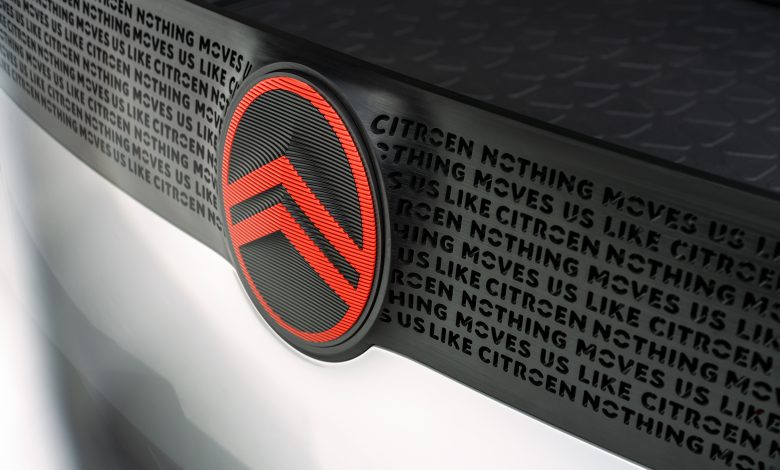
The French automaker in its latest release has announced that they will start with a new brand identity which is very similar to the first logo ever used by it. This change is representative of the company’s transition from ICE cars to electric ones. The new logo is similar to the one that the company started with in 1919.
The new logo is designed by the Citroën design team and global brand design agency Stellantis Design Studio. It marks the return of the oval to encircle the automaker’s deux chevrons – two upside-down V’s that recall chevron herringbone patterns. The company was presently using the deux chevrons directly without any enclosure.
In the new design, the chevrons have gotten the change of being thicker and their prominence has increased than in the original while the oval has been softened and stretched.

According to Citroën, one of the reasons for this change is to pay homage to the brand’s first logo adopted by founder André Citroën while making it feel familiar yet “modern and contemporary”.
Citroën CEO Vincent Cobée described the change by saying “As we embark on probably the most exciting chapter in our illustrious 103-year history, the time is right for Citroën to adopt a modern and contemporary new look. Our new identity is an elegant symbol of progress as we move our customers physically in daring, forward-looking vehicles that challenge traditional industry rules, and emotionally by ensuring their entire experience – particularly going electric – is more affordable, comfortable and enjoyable whatever their wants and needs. Our legacy of inspiring consumers with daring and revolutionary vehicles is energising us to adopt a different, more inclusive approach to future family mobility, and we firmly believe that customers past, present and future will agree that nothing moves us like Citroën.”


