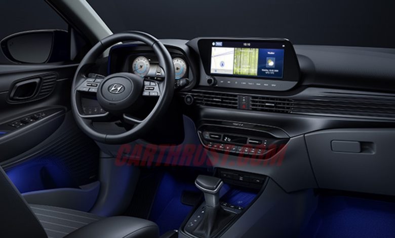
2020 Hyundai i20 interiors officially revealed

It was just a week ago when Hyundai released the official pictures for the next-gen i20. Although, the interiors of the car were kept under wraps back then. Now though, the company has officially unveiled the pictures of its interiors.
Let’s first notice that stylized steering wheel. It looks INCREDIBLE. It is the exact same steering design that we saw on the new Creta’s interior sketches. So obviously, this one also reminds me a LOT about the latest Audis. It’s by no means a bad thing people! The new infotainment system houses not one but, TWO 10.25 invh screens.
The dash now has a bold design with full-width horizontal blades across the front. There is blue ambient lighting which would probably be RGB programmable. And personally, I’d have disliked the absence of this ambient lighting after seeing their effect in the Altroz. The all-new i20 is available with three different interior trims: Black Mono, Black & Gray, and Black Mono & Yellow Green. Although, we can’t confirm whether all the 3 would make it to India. In case Hyundai decides to offer these in India, it would be great for the customers to have such an option to choose a color scheme like in a luxury car.
The two horizontal display screens might remind some of the Kia Seltos and that is bound to happen considering Kia is a part of Hyundai. When we first saw it in the Seltos, it looked more like a sub-standard copy of the Mercedes screens although, the i20 has a better design around it that make it look unique. Yet, it still is trademark Mercedes! The parts and design sharing with Kia doesn’t stop here. Expect the interior quality to be at par with Kia motors and more of the switch gear, UI and steering controls to be similar as well.


